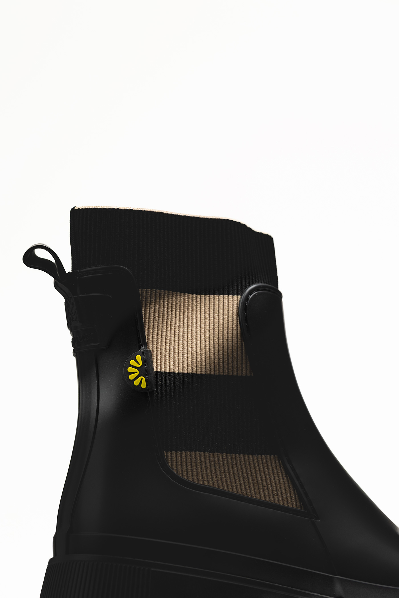
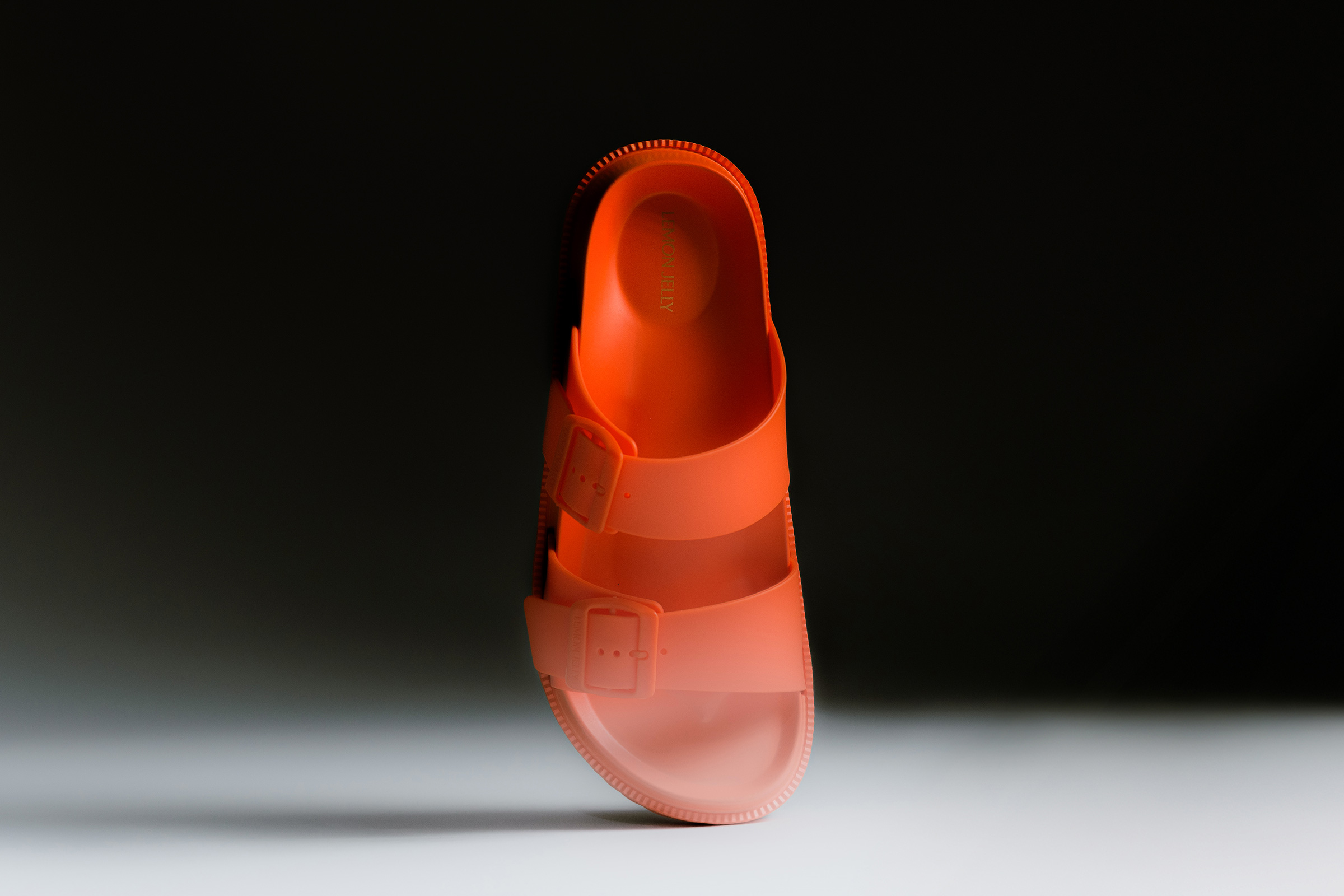
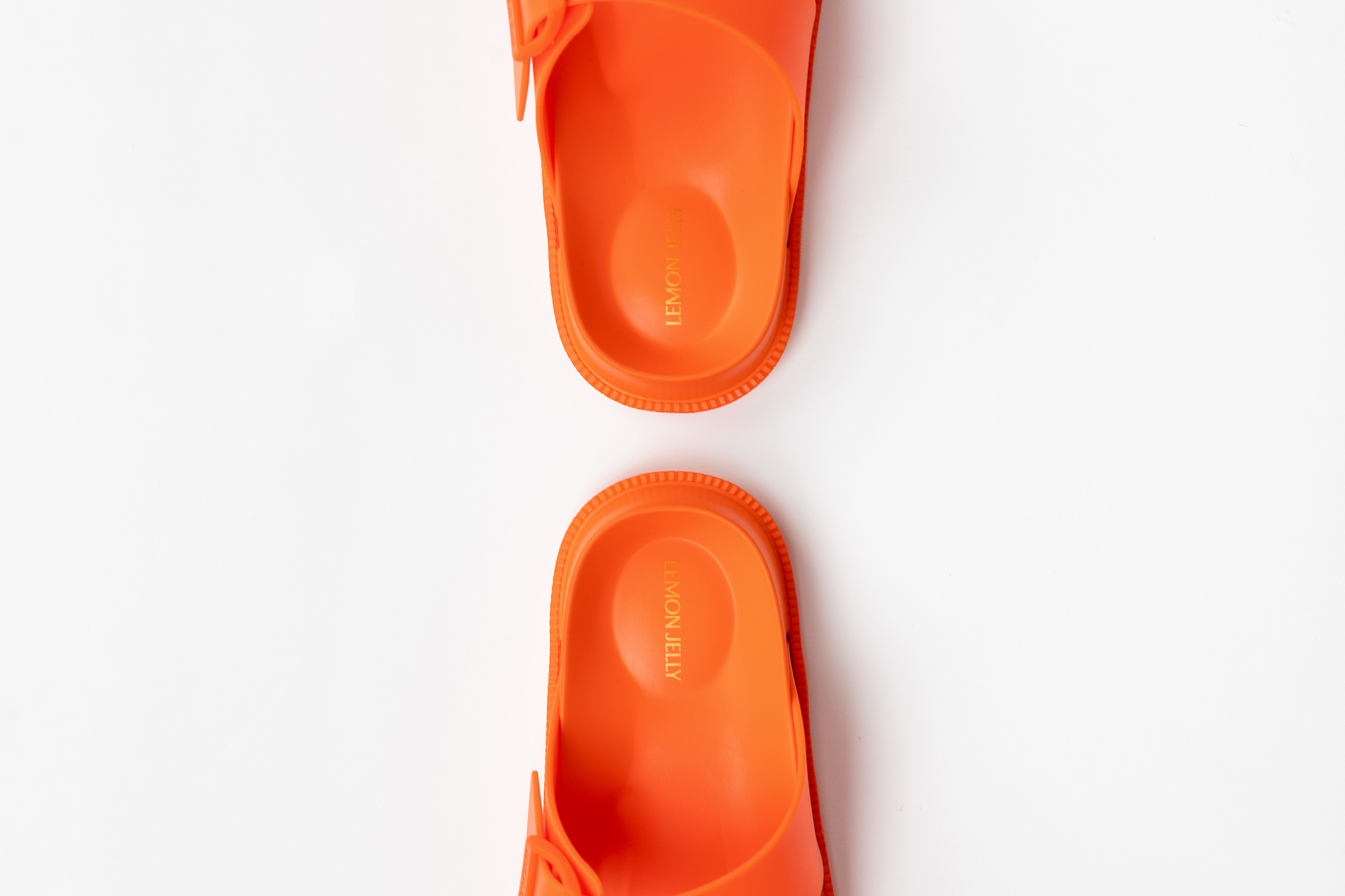
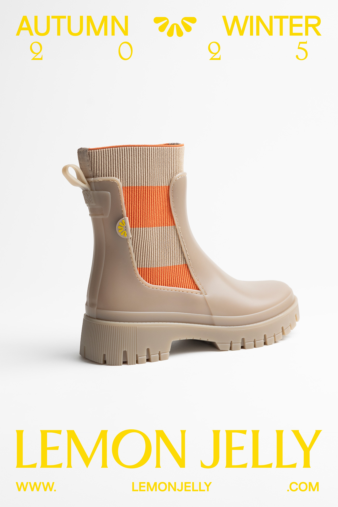
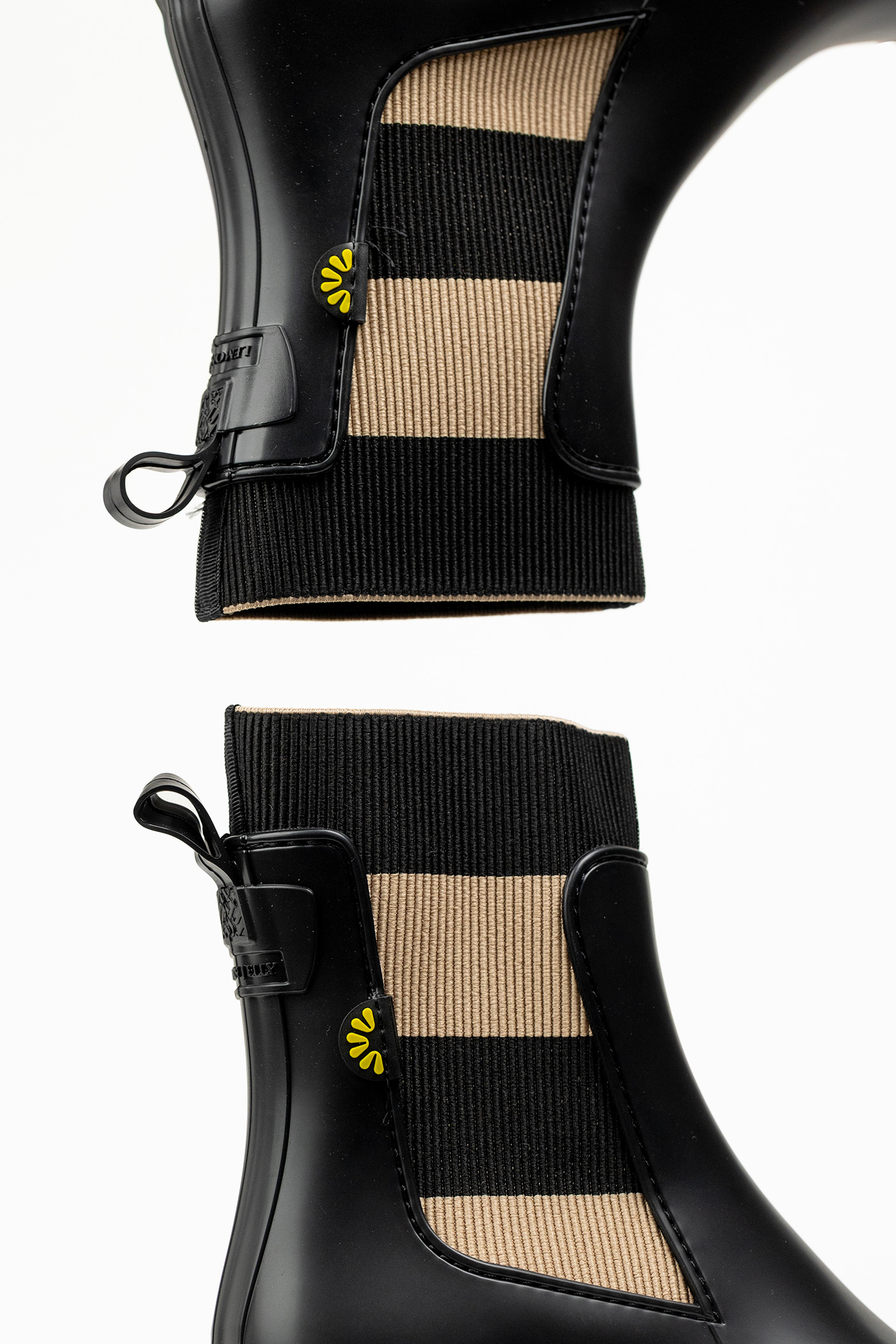
Elasticity has always been part of Lemon Jelly’s DNA. From winter protection to summer lightness, the brand moves seamlessly across seasons and styles.
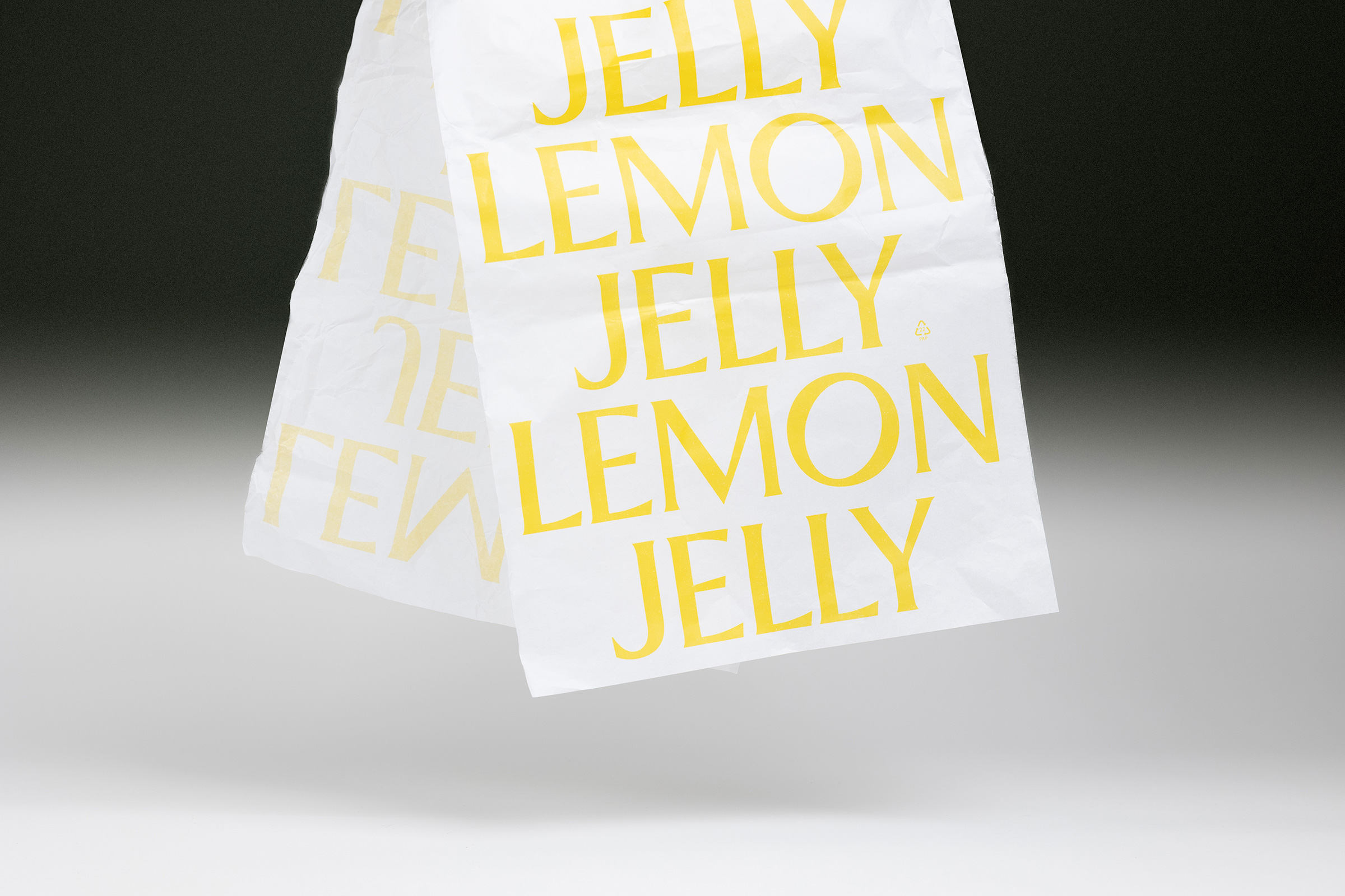
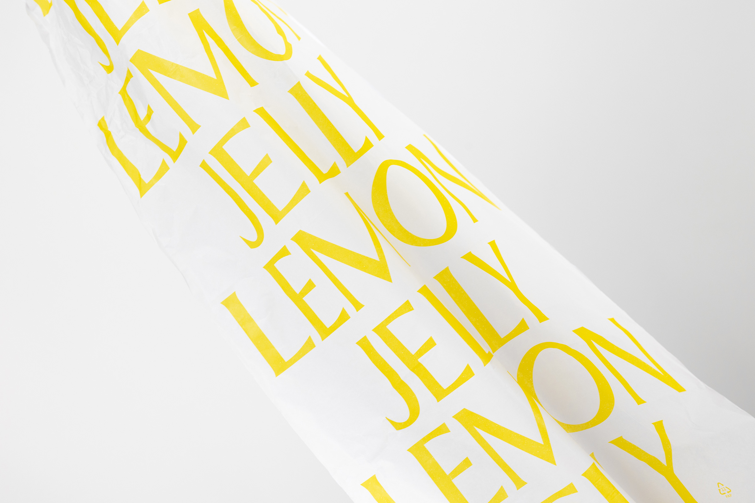
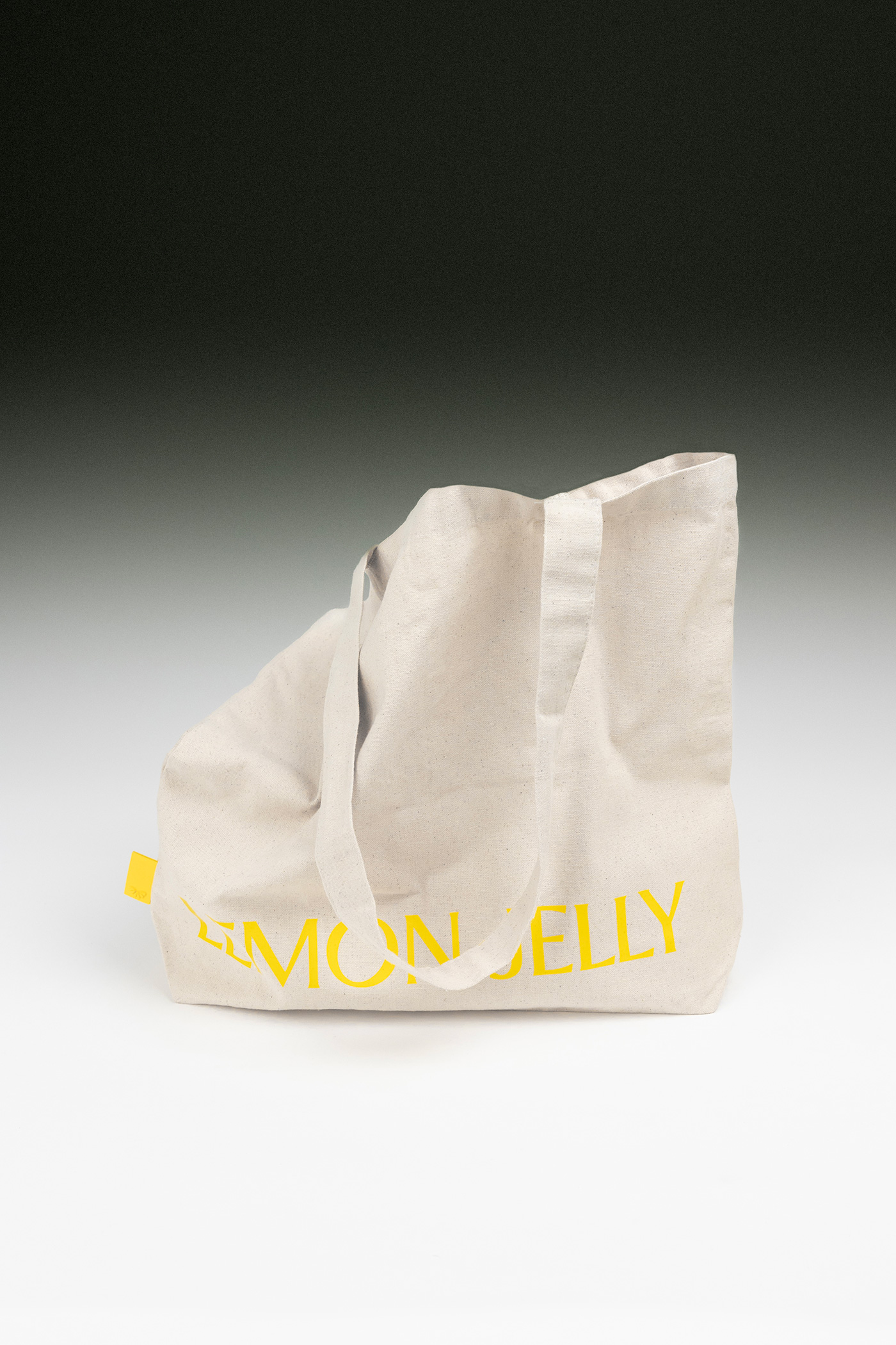
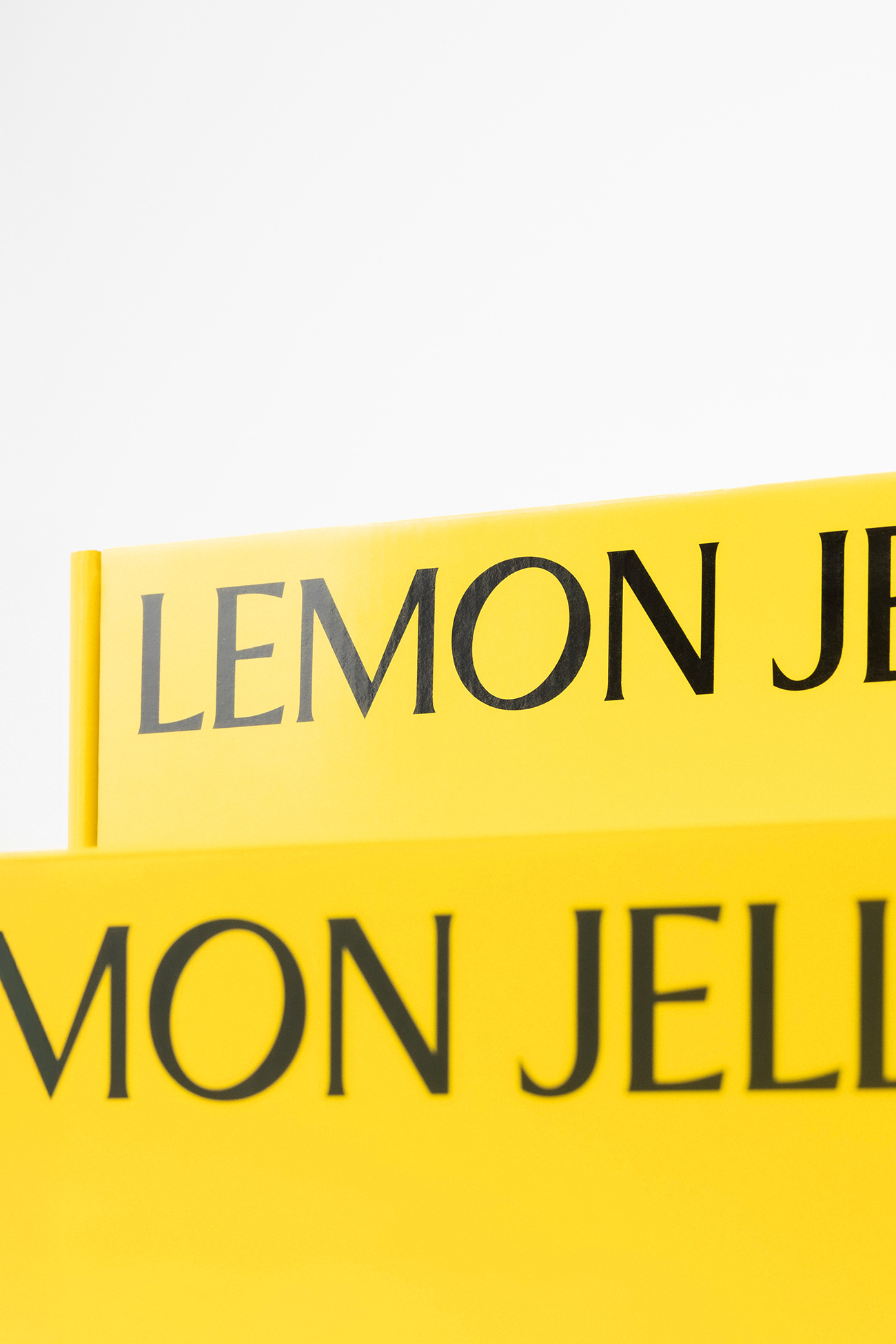
This rebrand translates that flexibility into a visual system designed to stretch and evolve. A modernized symbol and expressive typography introduce a renewed brand language, enabling expansion, movement, and play across compositions and design systems — fashion-forward, contemporary, and closely aligned with today’s retail world.
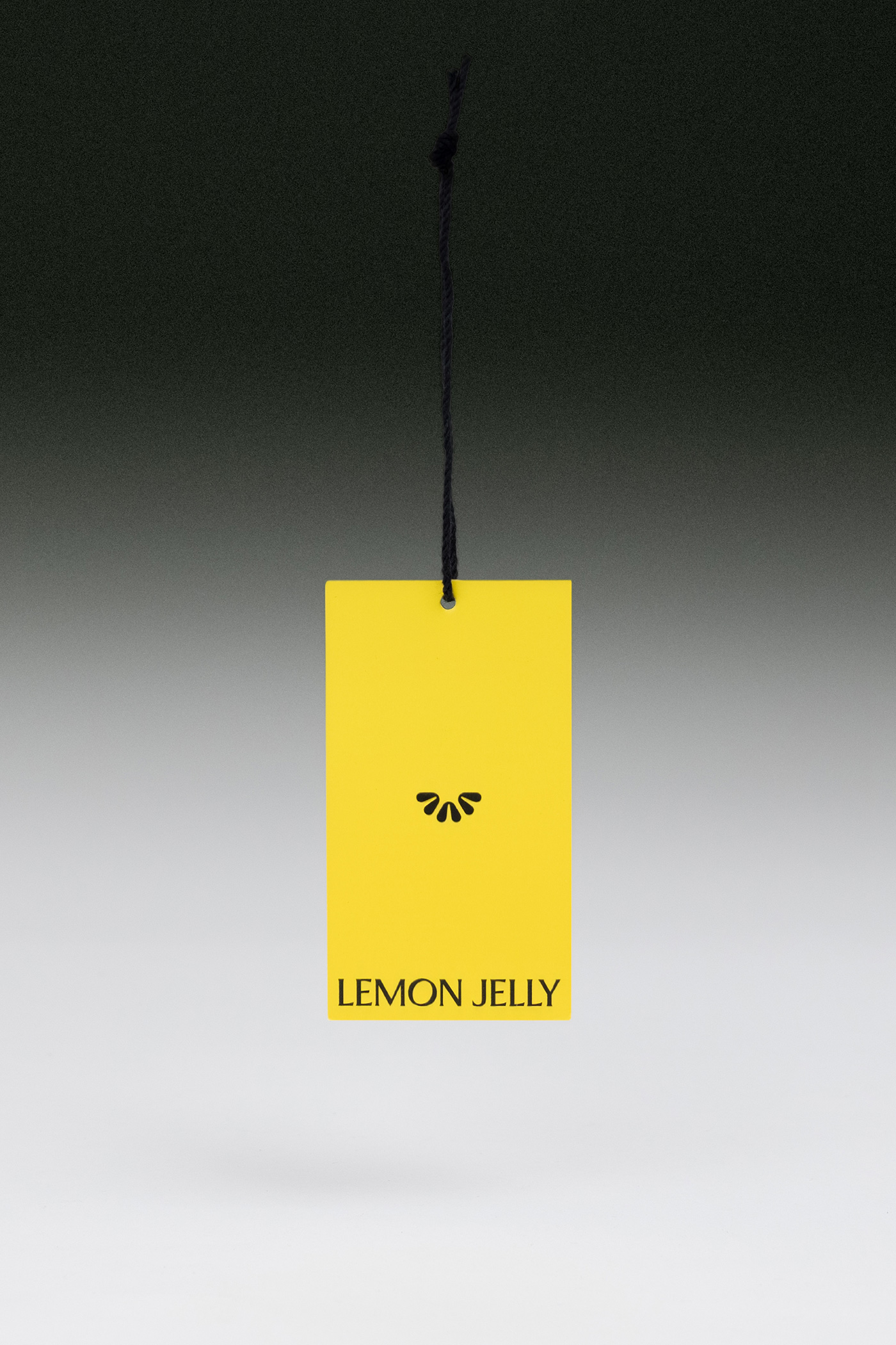
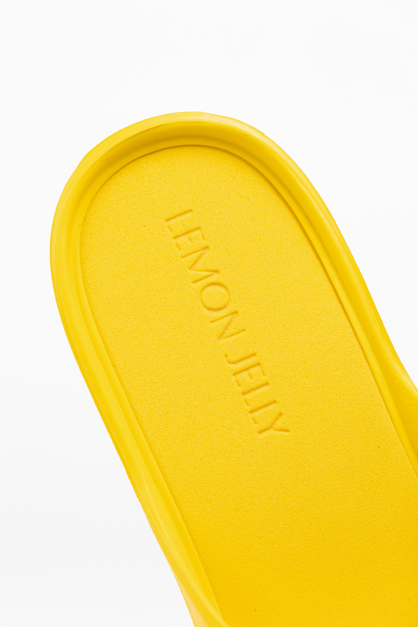
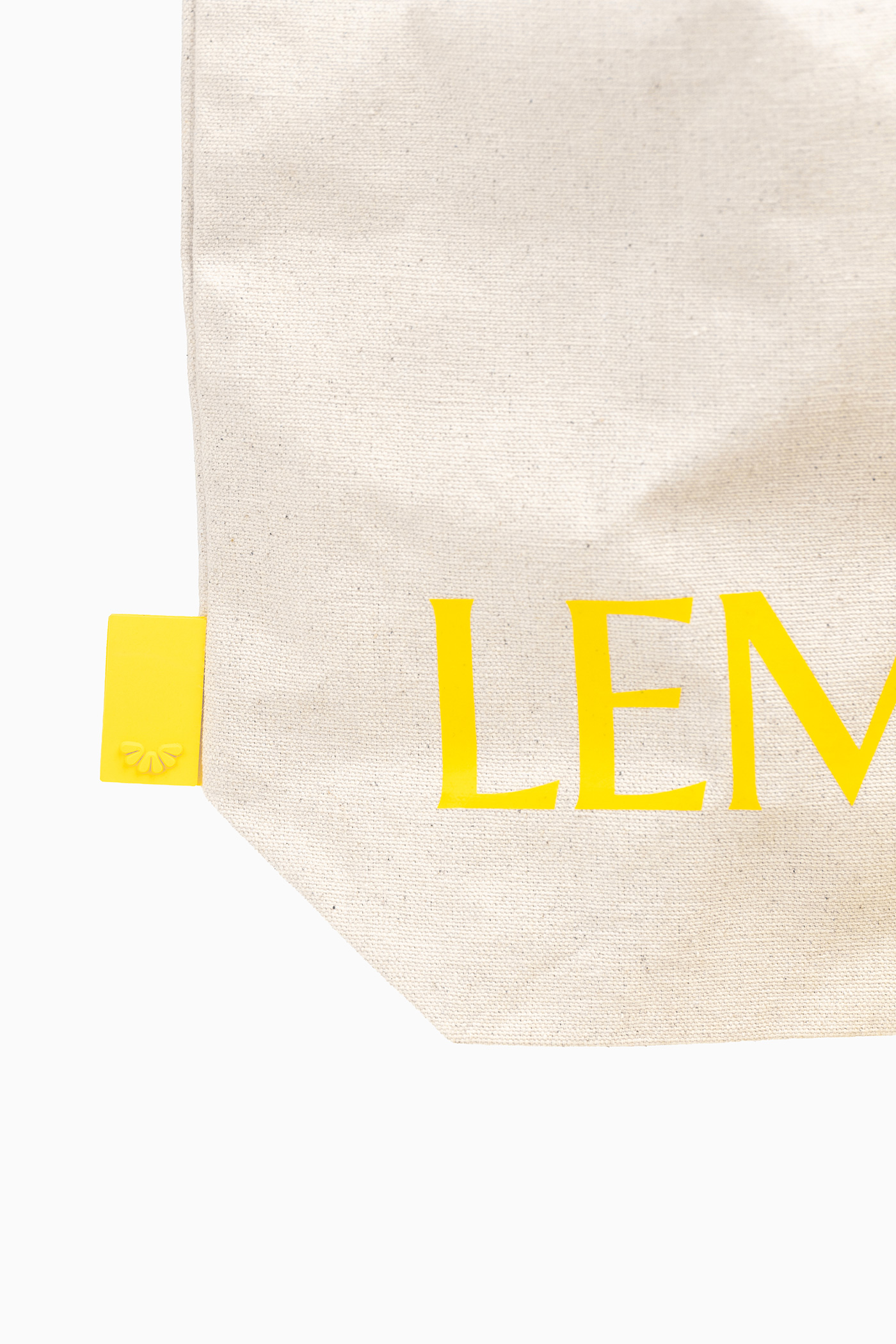
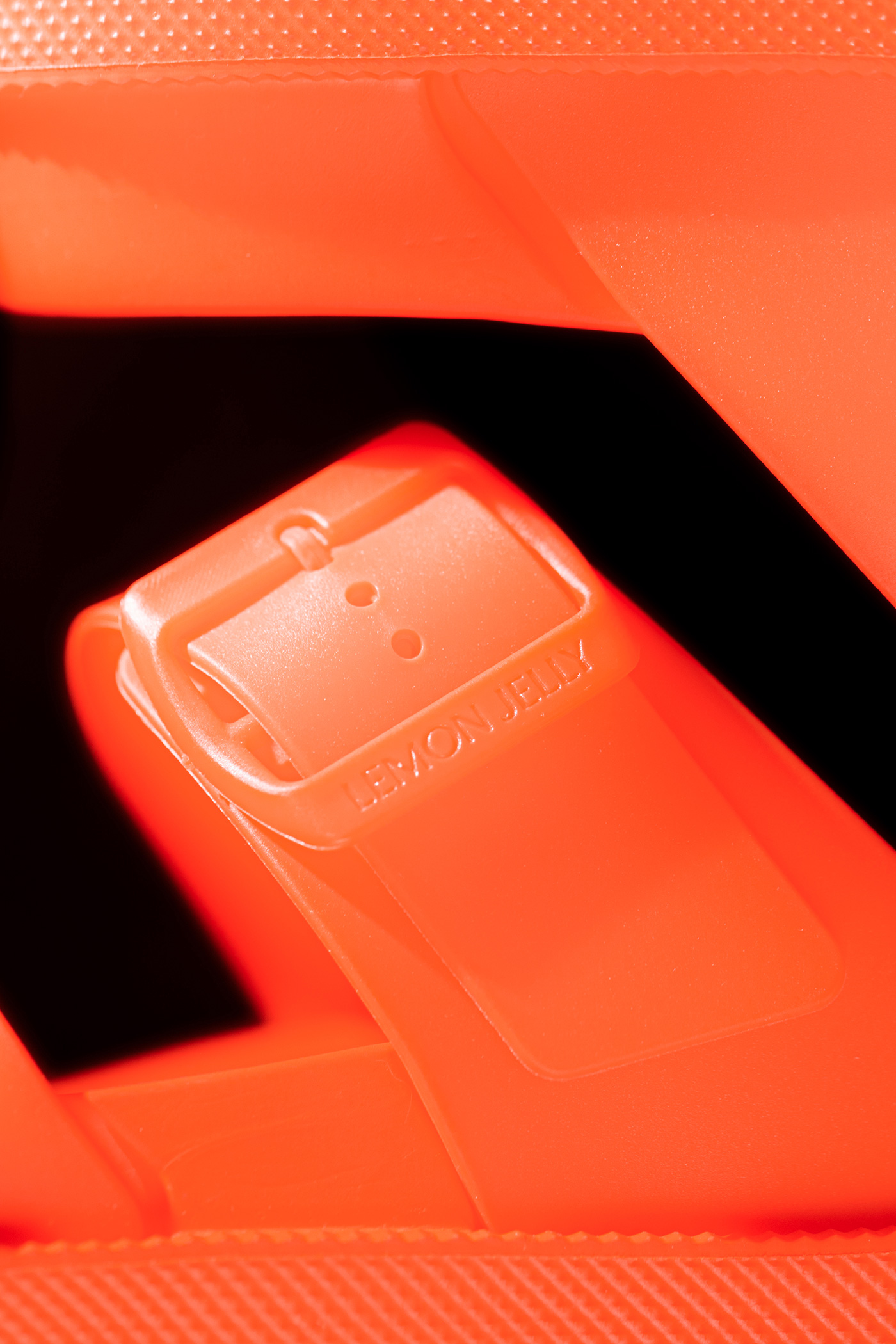
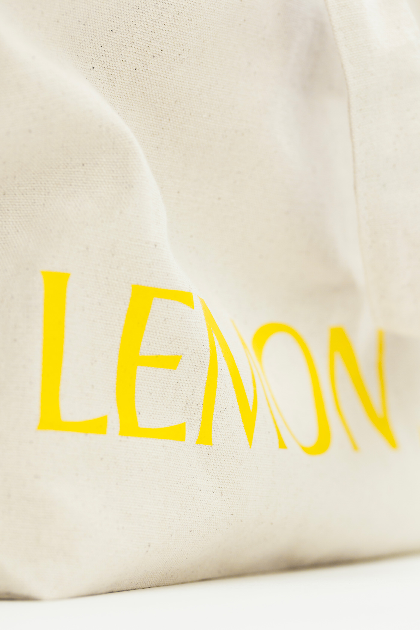
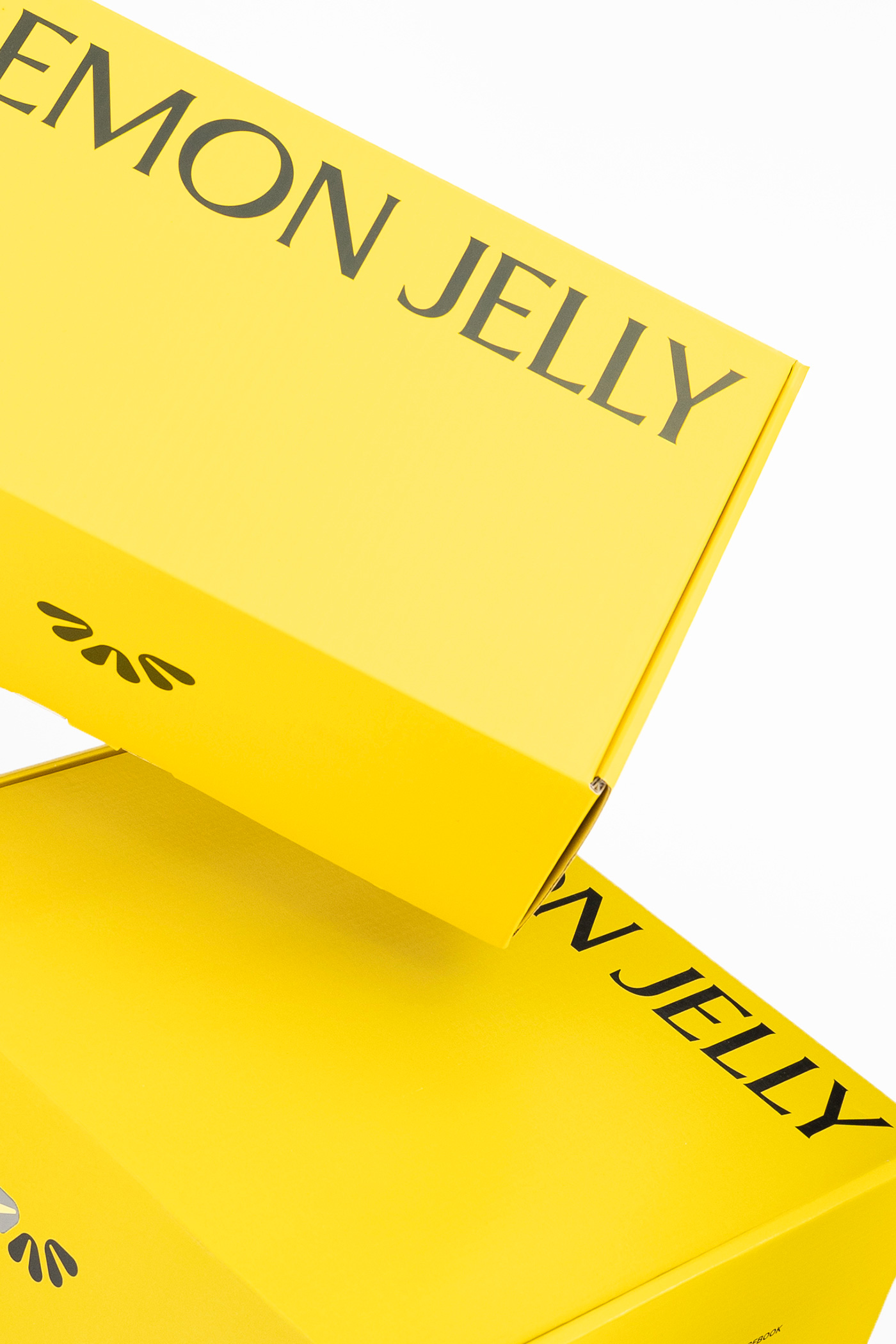
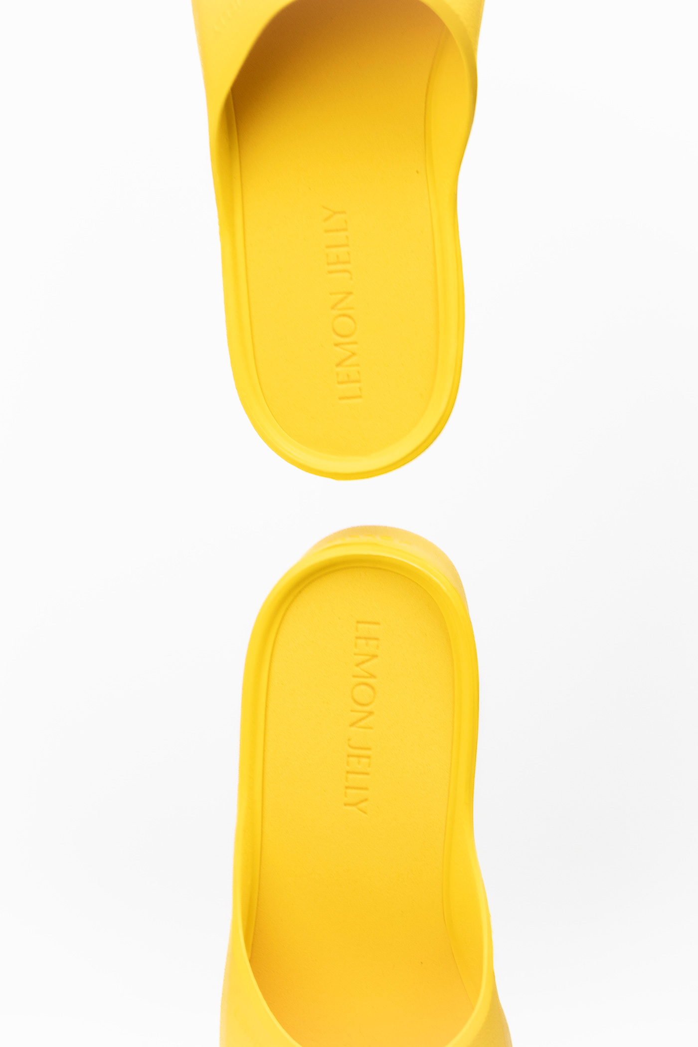
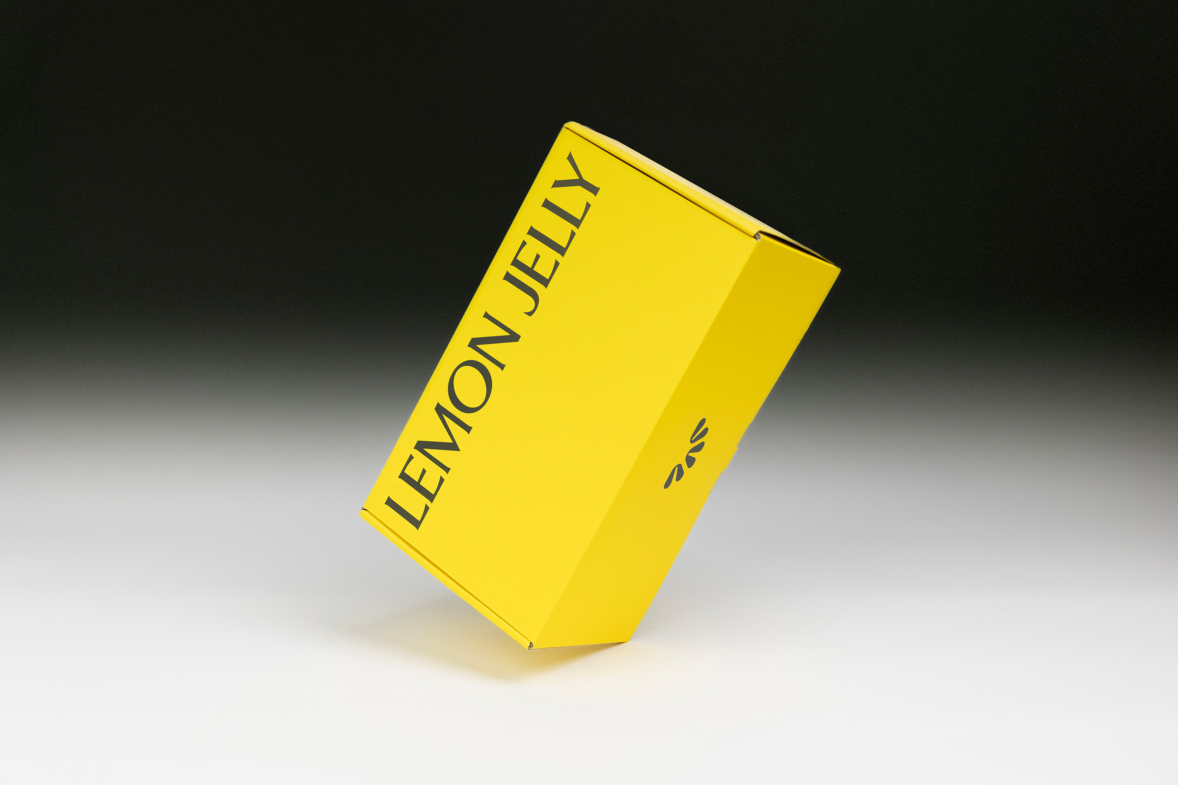
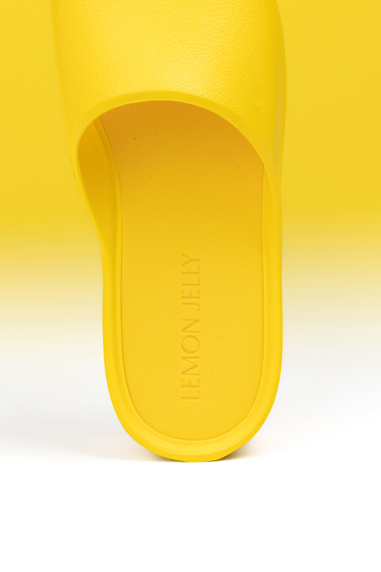
Subtly refined yet instantly recognizable, the colour remains unmistakably yellow, grounding an identity that feels natural and at ease within a fast, competitive environment.