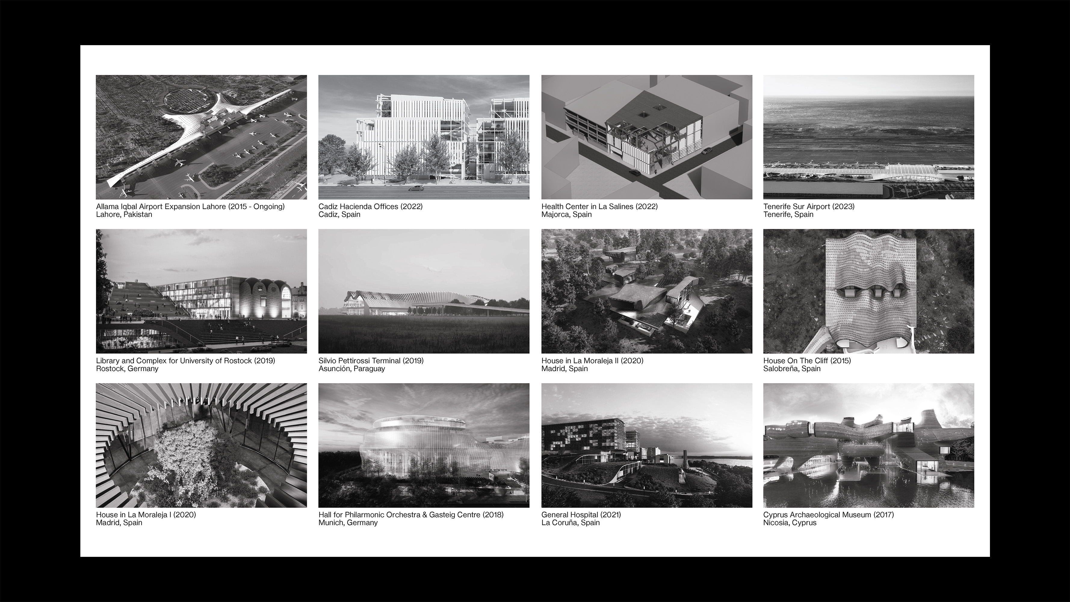
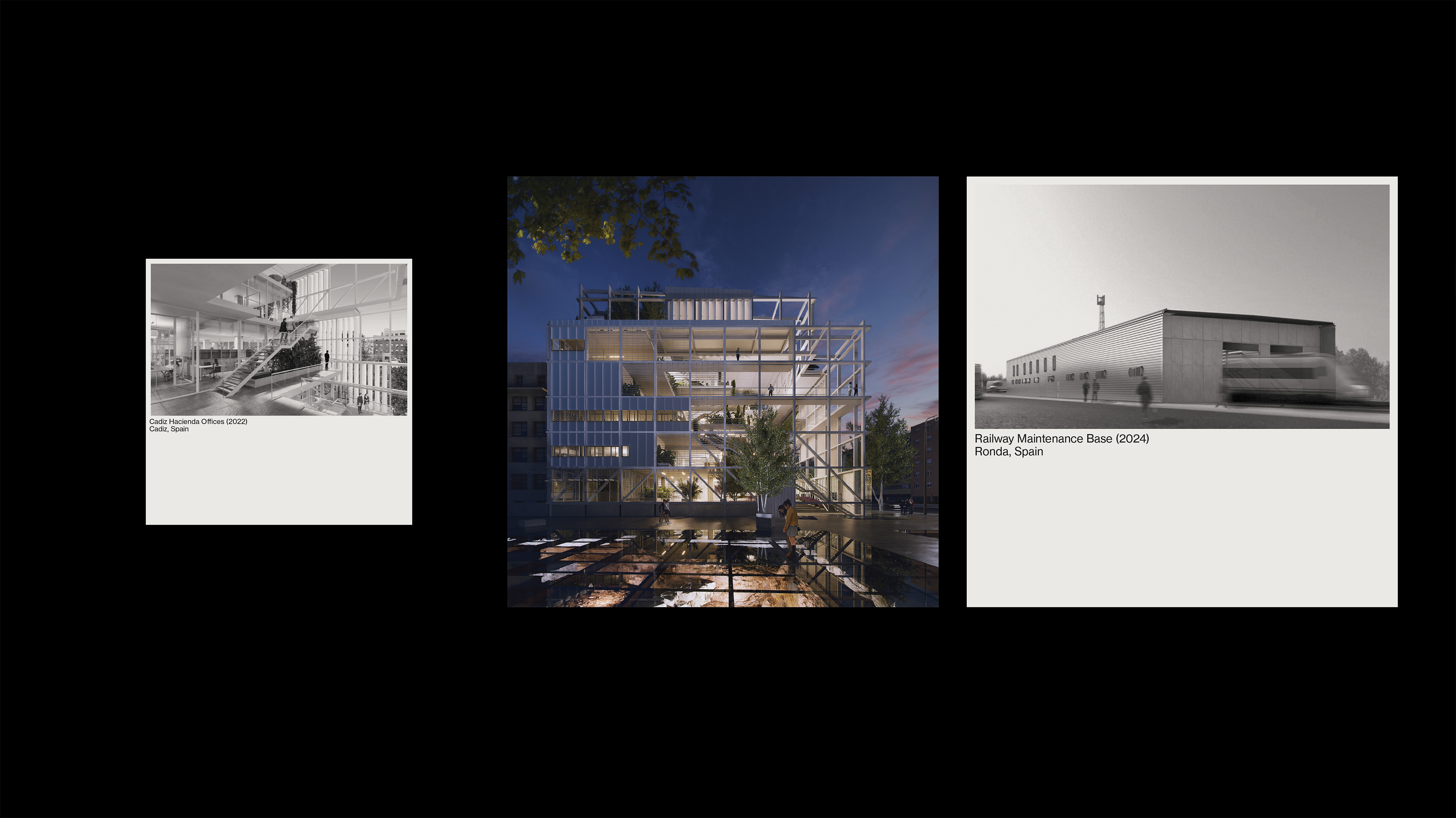
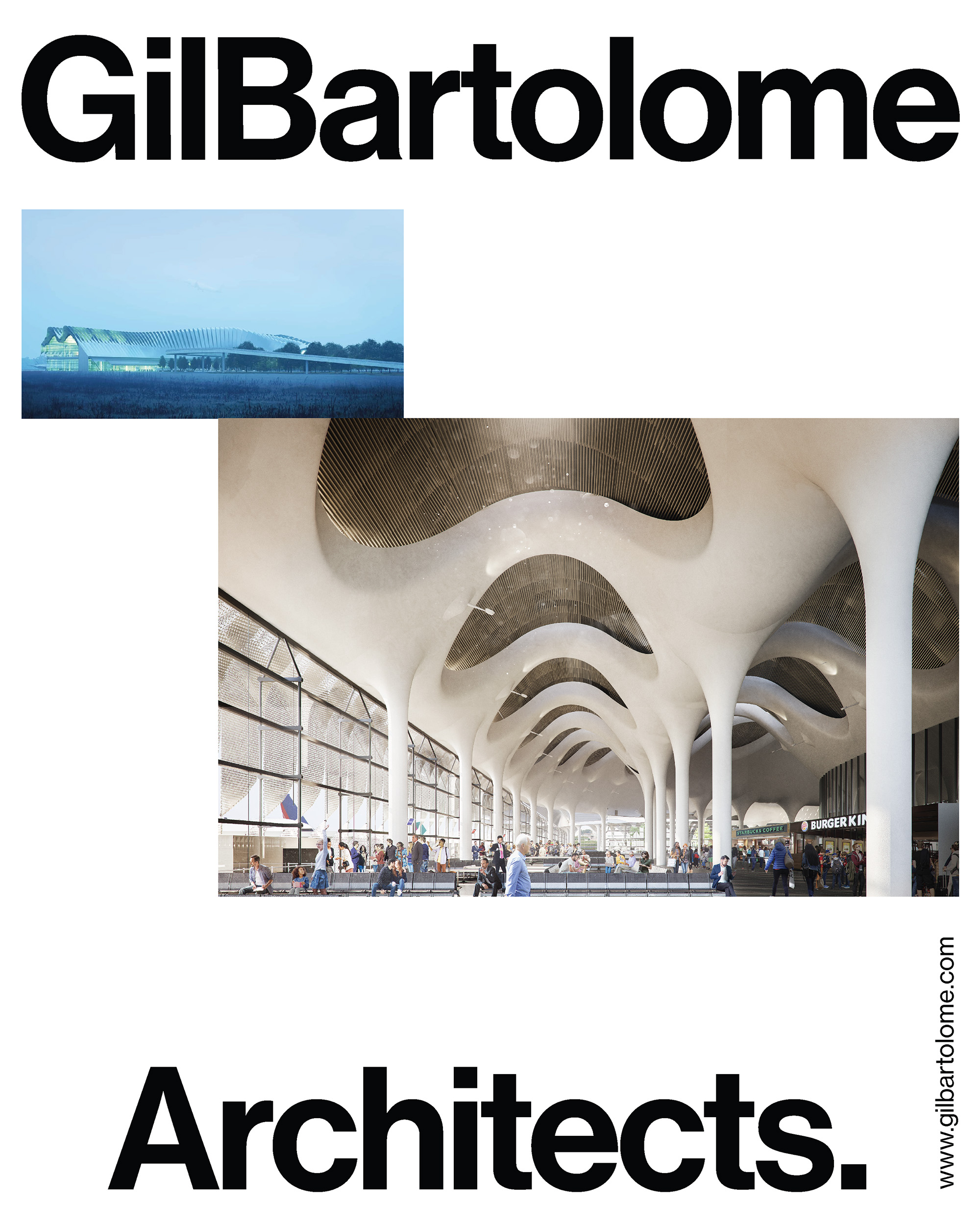
The “dot” becomes a central motif, shaping geometric patterns, modular grids and layouts that convey stability and order. This meticulous approach guarantees their identity resonates as much visually as it does conceptually. The palette — neutral tones like beige, black, white and gray — was chosen to reflect the studio’s seriousness and sophistication, while generous use of white space adds clarity and refinement. The use of accents of color in photography bring subtle warmth without compromising the overall sobriety and professionalism of the design.
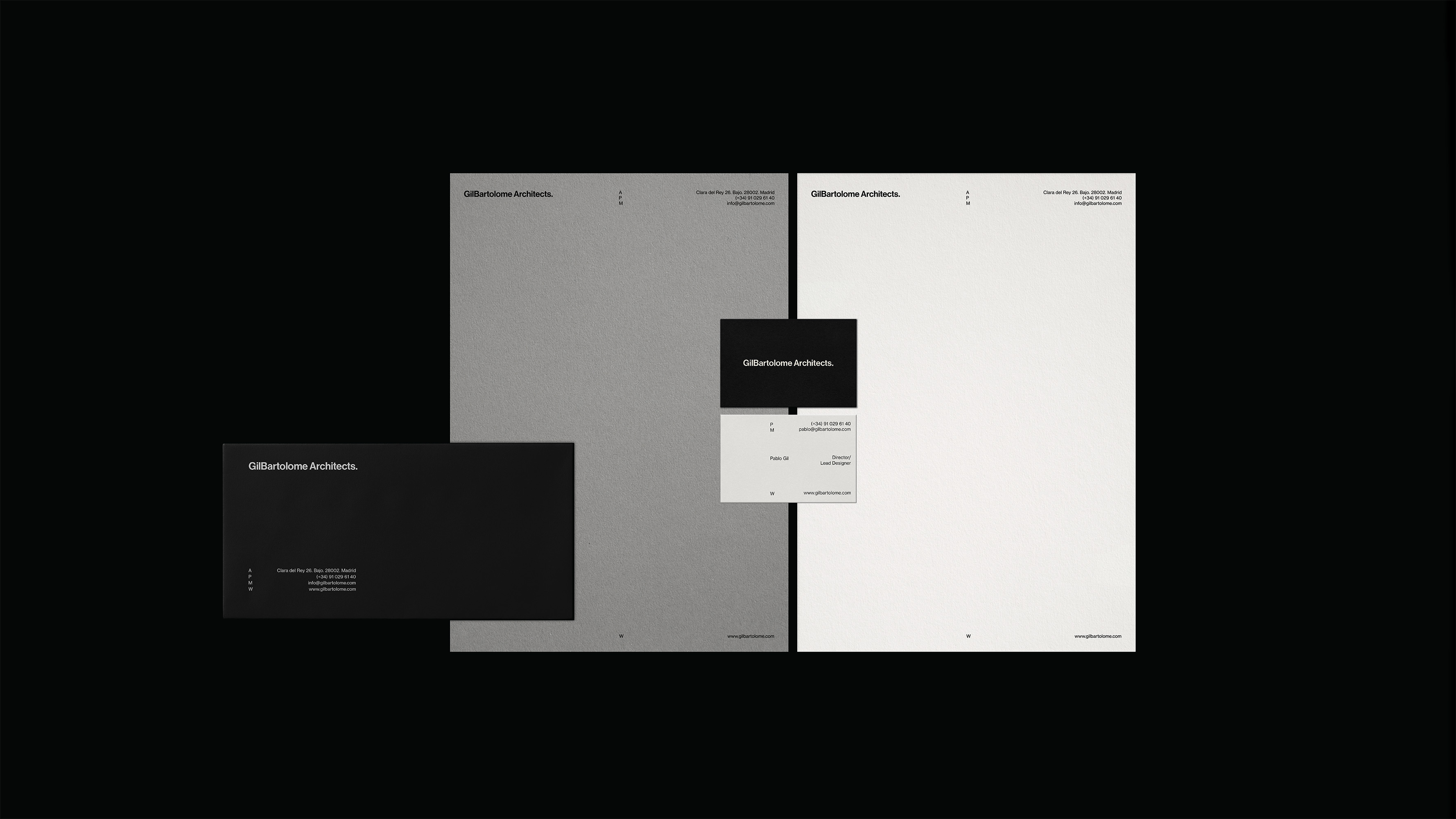
Our approach was guided by the clean, rational and functional principals of the Swiss Style design. The result is a visual identity that amplifies the brand’s credibility and excellence while staying true to the timeless elegance of their work.